Powered by MOMENTUM MEDIA
world of aviation logo

Qantas reveals new livery and logo

written by WOFA | October 27, 2016

livery_small2
VH-QPJ flew into Sydney from Victorville, California – where it was repainted – on Thursday morning. (Seth Jaworski)

Qantas has unveiled an updated livery and kangaroo logo to coincide with plans to introduce the Boeing 787 into service late next year.

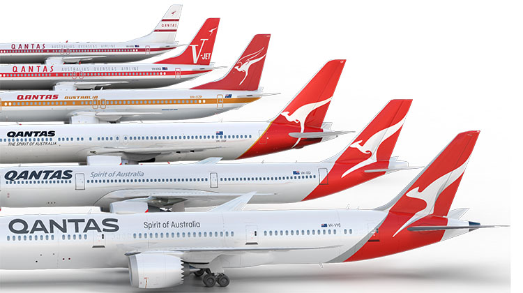
The airline says the new livery is only the fifth to be introduced since the kangaroo first appeared on Qantas aircraft in 1944, and the first livery refresh since 2007 ahead of the Airbus A380’s introduction into service the following year.

“A fresh brand helps symbolise the new era Qantas is entering as we head towards our centenary. It’s an era of new destinations, new technology and a new standard of service,” Qantas CEO Alan Joyce said in a statement on Thursday.

The new design was overseen by industrial designer Marc Newson in partnership with Australian design agency Houston Group.

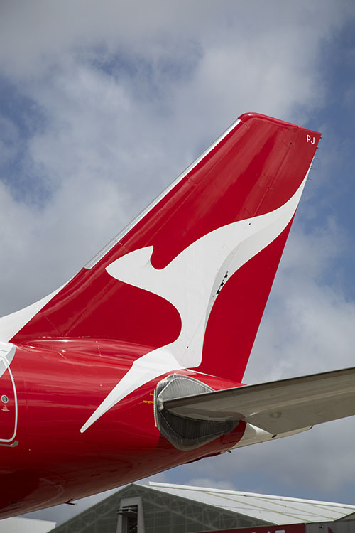
“This new brand is more streamlined and the shading behind the kangaroo gives a better sense of movement and depth. A silver band now extends from the tail to the rear of the fuselage, to give a more premium feel,” Newson said in a statement.

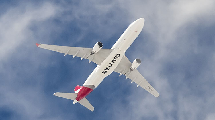
“The typography for the word Qantas, which measures almost two metres high on the 787, has been carefully streamlined. And Qantas will appear on the aircraft’s belly, so you can tell when it’s the national carrier flying overhead.”

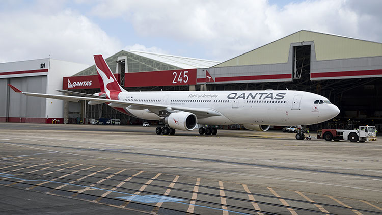
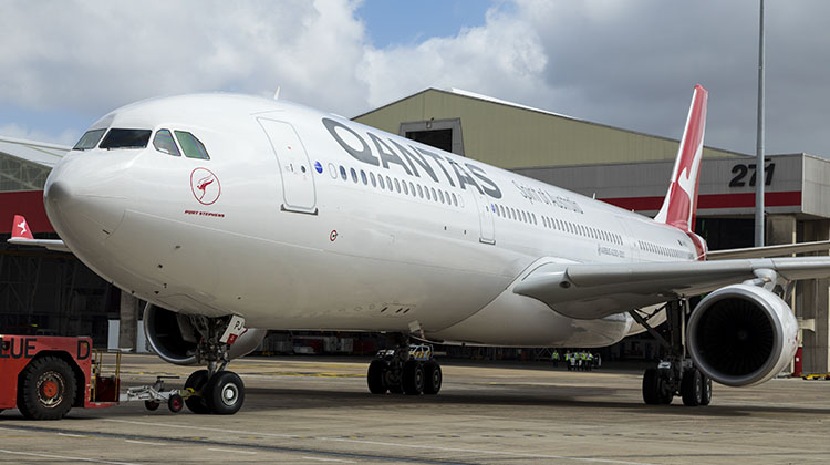
The first aircraft to be repainted in the new livery, A330-300 VH-QPJ, was unveiled to media and guests at Qantas’s Jet Base at Sydney Airport on Thursday morning, where the airline also unveiled first details of its 787-9 cabin configuration.

==
==

The new design will gradually appear across the Qantas network from today, starting with digital assets, signage and advertising, the airline said.

“Updating branding on aircraft will be sequenced with scheduled re-paints, to be completed in time for the airline’s centenary in 2020.”

liver1_small
VH-QPJ is towed into Hangar 96. Note the positioning of the traditional flying kangaroo and aircraft name under the flightdeck windows. (Seth Jaworski)
NEW QANTAS BRAND SUMMARY 
  • A streamlined kangaroo on the tail of the aircraft, with shading to give it a sense of depth and movement. The kangaroo itself has been simplified for a cleaner, more modern look.
  • A silver band has been added to the rear of the aircraft, flowing from the tail through to the rear of the fuselage for a more premium feel and more contrast between the red tail and the rest of the aircraft.
  • A new, slimmer font for the world ‘Qantas’ on the side of the aircraft and the colour made slightly lighter.
  • The word Qantas is added to the belly for increased visibility when aircraft are flying overhead.
  • Adding the kangaroo to the inside curved edge of the wingtips so that they are visible in-flight and meaning they will also appear in pictures people take out the aircraft windows.
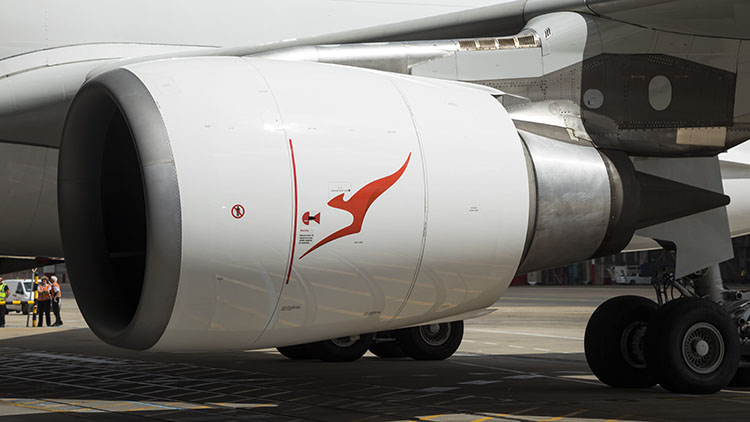
  • Replacing, centring and enlarging the kangaroo that appears on outboard engine cowls, so that it is more prominent and identifiable.
  • Re-introducing the iconic ‘winged kangaroo’ that featured on Qantas tails in the 1960s, ’70s, and ’80s by placing it under the cockpit window and integrating it with the aircraft name currently in this position (note: the actual aircraft names are unchanged).
    The classic ‘Qantas red’ and white of the fuselage are unchanged.

Source: Qantas

livery_small3
The enlarged logo on the engine nacelle. (Seth Jaworski)
livery_small4
The arm-less roo. Note the shading on the rear of the roo’s body and tail. (Seth Jaworski)
© Kurt Ams
The new livery features the Qantas name on the underbelly. Note too the silver band ahead of the red tail. (Kurt Ams)

Qantas has published this video of VH-QPJ being repainted:

And it has released this video to promote the new livery:

QF tails line-up copy
Evolution of the Qantas livery in the jet age. (Qantas)

97 Comments

  • Allan

    says:

    travelled from london to sydney this year on business and they should have invested the money in their food choices. Neil perry food was awful. i do not like the new logo it looks like a child drew it. what a waste of money. Juice will go down as that guy who made qantas logo awful.

  • Geoff

    says:

    A move too far, resulting in a once proud and recognised brand being wrecked.

    Why can they not learn from the best like Singapore Airlines? SQ have a consistent and quality product in every respect.

    Leave the current livery alone and put effort into the cabin!!!!

  • MJ

    says:

    #bringbackthepaws !!

  • aMANDA

    says:

    If you’re not familiar with the brand, this logo is no longer a kangaroo. It’s just a vague swirl. Since by definition, Qantas is trying to sell to foreign markets as an airline, that’s a major fail.

  • Narasimha

    says:

    The kangaroo doesn’t look like kangaroo anymore. It’s front legs are missing in the logo. The previous logos were much better than the new one. Even the new QANTAS font is not impressive.

  • Spencer G Jones

    says:

    Change for changes sake – Such a shame that the world renowned QANTAS tail logo has been changed – Don’t like it, All of our adult family (9 in all) have made negative comments about the change.

  • Martyn

    says:

    Bring back the paws i look for the Kangaroo i dont know too many that would tell you the sqiggle is a kangaroo

  • Wally the Wombat

    says:

    If it ain’t broke don’t fix it!
    In the picture above of the evolution of the logo, the 3rd one from the bottom is by far the best logo IMO.

  • Julian deCouter

    says:

    Oh good heavens, what a lash up. Nippers doing some fingerpainting could have done better.
    There was nothing wrong with the Logo.
    You guys seriously need to look at cabin comfort across the classes, improve the food and beverage operation significantly. Otherwise you may as we’ll ask PAX to bring their own pies and bottles for long hauls.
    Singapore, Emirates, Qatar leave you in the hangar folks.
    Best have another bloody good rethink and get a hurry on, in time for the 787-9s or you’ll still have a reputation of flying cattle transport.
    It’s a bloody long way and a horrendous amount of hours in the air to do Perth to London in a single hop and you’ll have some very stroppy customers when they arrive tired out and aching from around 18 hours in a back breaker seat and given a crook nosebag to fill up on.
    At 6’3″ even your business class leaves me feeling like I’ve spent the night on a wooden park bench.
    Big changes needed all round and trim the prices to match the market.

  • Ray E

    says:

    Looking forward to the ‘V-Jet’ livery for Retro Roo III. Hopefully QANTAS will get that done soon. Maybe on a 747 instead of a 737 like the past two.

  • Christine Thompson

    says:

    Leave current exterior alone – put some imagination into the cabins. They have been long overdue a major overall. Recently flew from LHR to SYD premium economy in A380. Seats were the most uncomfortable I’ve been in in years domestic or international.

  • Ben

    says:

    Thumbs up to #bringbackthepaws – The new roo looks hideous and the new typeface leaves me cold – It needs to be stylised somehow. I actually think if they’re going to change it they need to go for a wholesale colour scheme change. I seriously think they went down the wrong road by going to an all-white fuselage back in 1984. Since then I’ve always thought that Qantas aircraft have looked really boring. Qantas has sometimes offset the colour blue with the red tail in its marketing. How’s this for an idea for a new livery: Predominately blue fuselage (i.e. a nice pleasant shade of light blue all over the fuselage, where it is currently white.) Then have the Qantas typeface in white, instead of it’s current black – To offset it nicely against the blue fuselage. Then leave the tail and the roo alone (red tail, white roo – with paws) Now that livery would be refreshing, modern and interesting to look at. It would look great on any aircraft and still preserve the heritage of one of the world’s most iconic airlines. While Qantas are about it, they need to ditch the white pilot caps and get rid of the pink on the flight attendants uniforms – the pink colours just look out of place.

  • Jessta

    says:

    Should have spent the money on doing something about those awful cabin crew uniforms. They look terrible and are no reflection on anything Australia at all. As for the scribble on the tail, what Kangaroo has no paws? Now the outside matches the inside – awful!

  • Neil Bolton

    says:

    Love it. A beautiful refresh. And unlike some, I believe Qantas does a wonderful job. I wonder if some of these critics have actually flown much, and whether they have flown with the airlines they discuss.

  • Ross

    says:

    Are Qantas changing their logo in readiness for a take over? Maybe from an international carrier who wish to be able to easily re brand.

  • R.Wilson

    says:

    Really this is what they call a change?! i flew business class to LA earlier this year and it was pathetic, the cabin of the A380 was tired, scuff marks all over the ‘pods’ the seats/beds were hard and uncomfortable and little room for taller people to stretch out, sleep was impossible, perhaps instead of making tiny changes to your livery which require the whole aircraft to be repainted you could put the money into your actual product!

  • Skippy's mate

    says:

    I think Skippy would be ashamed to be portrayed like a cartoon character. No arms no real ears just a swirly pattern. Sorry Skip soon you’ll be a white squiggle called by some foreign name.

  • Geoff

    says:

    R. Wilson is right. Forget fiddling with the “known” livery detail and go back to basics as clearly these are bereft in this equation.

    Remember, it is a people business, meaning “service”. Ignore this at your peril Mr Joyce. Take note.

  • Tim Canning

    says:

    I agree with so many here. They have Ruined the Roo.

    First by taking the wings of it and now the paws – what’s next?

    Economy passengers will be squeezed into 9 across seating. QF are saying the economy seat has more room. Believe it’s about an inch more pitch but narrower seat with 9 across squeezed into 787 Dreamliner making it a “Nightmare liner” especially on PER/LHR route. The Dreamliner was not made for 9 across but 8 in economy.
    More here https://blogs.crikey.com.au/planetalking/2016/10/27/qantas-has-some-tight-news-for-full-sized-australians-in-its-787s/

    I gave up on QANTAS years ago after AJ grounded the fleet.

    I will stay with quality airlines like – SQ and VA

    Sad as QANTAS use to be one of the world’s best airlines. Shadow of its former self these days.

  • C robson

    says:

    What’s that white thing on the tail.
    I hope you did’nt pay for it.

  • Collns

    says:

    As usual they would rather spend a shed load on this tripe and the quite awful new tech uniforms than actually fix or even recognise the real problems. Food [for god”s sake bin Perry I wouldn’t get a burger from his place] cabin service attitude especially in cattle class and quite how the fares charged can be justified when compared to other offerings is a constant source of disgust

  • Grant

    says:

    One very sick roo. Don’t mess with something that has worked for QF forever, also put the wings back. Give poor red some character and let him fly as before.

    Whats with the type face!!!!!!!

  • Daniel

    says:

    Each of these comments bar 1 echo the same sentiment AJ does not take seriously Qantas what it was and what it could stand for PRIDE
    The new livery so so a kangaroo does not need to look like a bolt of lightning and food wise heard this from Qantas staff such a large spend to no avail and the A380 its a sad plane love the SA 777 great food comfortable seats and service second to none went for the GP brilliant

  • Vannus

    says:

    Everybody’s got to have a whinge!

    It’s called ‘Resistance to Change’ factor, in Psychology!

    It still looks like a’ Roo!
    Love the new font.

    Brings it all into the 21st Century!

    Good one, Mr Joyce!

  • Ron

    says:

    Looks good until you get aft of the cockpit. In a few years some wunderkind will come up with the idea of putting wings on the kangaroo and he will be greeted as a messiah. Change for the sake of change.

    Silver is more premium than gold?

  • Tropicalcat

    says:

    Who comes up with such crap, “a sense of depth and movement” it’s something you’d expect from a 10 year old.

    The last redesign was, wait for it, only 9 years ago.

    You just put your head in your hands at this sort of PR speak drivel.

  • Dave

    says:

    Looks smart, elegant and modern. Well done.
    I like the underbelly name too

    Not sure what all the whinging is about, sounds like old-school Qantas bashing. Aussies love to do that for some reason. We have a great national carrier all things considered. Sure its been through a tough few years but its definitely on the way up.

  • Jimmy

    says:

    What are all these people sooking about?? Coming from a graphic design background, I LOVE the rebrand. The red gradient gives it a subtle depth and the font is a lot easier to look at. Also the roo is growing on me (you’d be stupid to say it doesn’t look like a roo). It’s nice and refreshing.

    Cabin-wise, however, there are several things I can agree on that need to change and improve. First, the food is fairly mediocre. The food needs to taste more fresh and genuine, and the menu needs to be updated. Second, the space between rows is a little too confined for my liking. Perhaps adding at least 30 cm of leg room will suffice. Also the seats need to lose firmness and feel more ergonomic and soft, to an extent. Lastly, the IFE needs to be improved as follows: Brand new full HD touchscreens with a faster response time. Better audio quality and an extra 3.5mm jack socket for own headphones alongside the standard L and R sockets. Also diversify as well as add more IFE choices with regards to movies, TV, music etc.

    Overall, still my airline of choice.

  • blackandwhite

    says:

    100 different people 100 different opinions. I like it, the new “q” looks cleaner than the kangaroo looks more modern. Change always stirs up people who are afraid of change.

  • Taurean Lea

    says:

    That has got to be the best chapter in the history of Australian Aviation, because this brand new QF logo looks more modern and much more futuristic than the 2007 brand!!! We now have lots of generations of QANTAS kangaroos and I think this would look great if lots of QF aircraft could wear older Retro liveries, take the 1984 livery with The Australian Airline titles for example, or we could give one 737-800 the 1961 livery, which John Travolta’s 707 still wears!!! 😀

  • angelo calleja

    says:

    Why not just do with the Roo, and have a big red tail. the QANTAS font change is good, and again the underside logo is good for visibility.

  • Sandy

    says:

    The new pilots’ hats are simply appalling! Pilots now look like baggage porters from some 3rd world country. Who approved those? And the non-streamlined script on the fuselage looks silly. Overall, we now look like a hillbilly airline. Definitely not an improvement.
    Well, after 40 years of being a loyal Qantas passenger, I gave up flying our national airline when they started flying through Dubai; there are much better ways to get to Europe, IMHO.

  • Ian Deans

    says:

    Could have brought back the old Australian Airlines roo…..at least it looked like one.

  • Richard

    says:

    I’ve got to agree with the vast majority here. Putting aside what the planes look like on the outside (whoever heard of a kangaroo without paws), at the end of the day it’s what’s inside that matters.

    In July, I flew cattle class in Emirates, JAL and Qantas to Europe, Japan and back to Oz. The Qantas flight back to Oz on an old tired 747 with looped movies, abysmal food, a (I use this definition loosely) “seat” that set new levels of discomfort and indifferent crew was such a contrast to the other carriers.

    It’s not hard to compare products between airlines. Qantas would have to know they are not on the same par as the Singapores, Emirates, JALs etc but there appears to be little effort going on to refresh and improve the whole flight experience. That’s what really matters.

    I don’t think the negative comments about the new livery are Qantas bashing as others have suggested. I think everyone wants Qantas to succeed. It appears to be more frustration that Qantas management have once again failed to address the basic problems that have been long standing and unresolved. A pawless kangaroo and a different font does not solve the problems.

  • Gary

    says:

    So many critics!
    The joys of being a “national carrier” where people think they actually own you without having to buy shares.
    This design seems like a reasonable evolution to me.
    Get over it folks.

  • Bruuno

    says:

    I’m a shareholder so I think I’m entitled to pass comment on the design Gary. Overall, not a bad effort but the loss of the paws on the kangaroo is a loss of identity and defeats the purpose of having it in the first place. It’s not far from a shapeless swirl and for people who don’t know that it’s a roo on the back they’ll be hard pressed to realise it is.
    And the new caps, Not great but if they had some decent badging they might get away with it, Not something an 8 year old could whip up with a texta and a sewing machine.
    With Todd Sampson on the Board I expected better. It all looks a little too done by some ‘dynamic’ Gen Y’s and everyone lapped up the presentation when it was pitched.

  • Natasha

    says:

    Agree with comments above – this is frustration with management of a company that is succeeding in spite of truly woeful performance. It’s when people stop commenting that the problem will be too late to solve.

  • Steven

    says:

    Take away the vintage kangaroo on the nose, and the red one from the engine nacelle
    (see the Boeing 787 drawing for example of how much cleaner an all white engine looks)
    and it could work, I think they work against the more modern image the livery is aiming at.

  • Mark Johnston

    says:

    Just a minor observation but i thought Id throw it into the mix

    Some commentators are saying that this is Alan Joyce’s way of stamping his influence over the airline with
    this new branding ….the same way that Geoff Dixon did in 2007 when the last rebrand was done

    Back then, the aircraft that was rolled out in the new livery was Boeing 767 VH-OGD (Note the GD in the rego which conveniently spells out Geoff Dixon)
    Fast forward to 2016 and the aircraft used is an Airbus A330 VH-QPJ (now i know its not AJ but maybe Paddy Joyce is close enough :)))

  • Ben

    says:

    Wow what a massive comment response. It just goes to show how much passionate opinion a change to the national carrier can elicit. As per my previous comment here and my other comments on this site – I’m not a fan of Qantas and certainly not a fan of the new design. For others here that describe it as resistance to change etc. I would only say that change for the sake of change is not a good idea. I’m all for change but a pawless roo is a step too far. Methinks the problem may lie with Mr Newson. I don’t doubt he is a great designer but he did the A380 interior and that is hardly spectacular. His latest effort here, like I said, leaves me cold. They need to get someone who appreciates the heritage and is able to modernise with a new colourful livery that will capture the imagination. Think of it, the new roo is little more than a stylised letter T. Surely the national carrier can do better than that. My current dislike of Qantas is something that I wish could change. I wish it was a national airline I could be proud of and my carrier of choice. However unfortunately not at the moment. This latest update is not a good move and I think serious change is required. Yes Qantas may be back in profit, but I wonder how long for if they keep going in their current direction.

  • Grumpy

    says:

    Flying Kangaroo? Really? They’re kidding me right? Oh … they’re not … they actually convinced themselves that this IS a Kangaroo and the public would believe them…. beam me up Scotty. Please. Before I die of laughter.

  • Brenda

    says:

    Disappointing that you can’t recognise what’s supposed to be on the tail of the plane, look at Air NZ and when one of there silver fern beauties comes into land.
    Do like the underbelly. Laugh at people’s comments about the food, as in I agree, being a vegan I had no chance of getting anything being edible on a flight from BNE to LA. They had a great opportunity to come up with a range of ideas and then smashed it on social media to see what people voted for. They say profits are down but what did they spend to get that done which probably won’t last.

  • Bob

    says:

    The ‘Flying Kangaroo’? What kangaroo? I also wonder at the cost of this change in logo design. A shame the money was not put into passenger comfort and services.

  • Rocket

    says:

    @ Tony.
    The whole exercise as with much to do with modern management is laced with BS… note the use of words like ‘space’ to describe what was previously a ‘place’ or ‘department’ or ‘sector’, going-forward and the equally ungrammatical ‘going forwards’ – the point you make about ‘Spirit’ I’ll just give you some history.
    When the clown with the bow tie took over, he hated the fact that the Board decided to keep the name and Qantas branding… prior to him taking over, they decided to remove ‘The Spirit of Australia’ as the by-line and replace it with “The Australian Airline”, it was said at the time that it was done for a number of reasons, one was ‘spirit’ didn’t translate well in Asian markets. If that’s the case and wasn’t total BS to get the word ‘Australian’ on the aircraft somewhere to appease all those ex TN people who couldn’t handle change (and thought they were god’s gift to the airline industry even though they were almost broke and no one outside Australia had ever heard of them or their predecessor TAA) then why was it put back again less than 10 years later, then made even more prominent a few years after that??? They should have asked long-serving staff or long-loyal customers… the Sydney Swans asked their members what their alternative strip should be even down to alternative colors to red, whey couldn’t Qantas do the same.
    I think it’s really bad. We’ll get used to it but I predict sometime down the track in a more enlightened era it will be quietly changed to a more traditional version again… BA’s world tails didn’t last long did they and neither will this non-Qantas branding. Either that or the company will just lose its unique image as rubbish like this erases it’s history.

  • ctj

    says:

    Yes I concur with previous comments completely
    The stylised Roo is unattractive……bring back the winged roo everybody loved that logo!!
    Flight attendants uniforms are only marginally more attractive than those of VA…… (ugly)
    And cabin service continues to deteriorate in the absence of any real competition
    Dont airlines realise that what passengers remember most about a flight is cabin service and amenity?

  • Geoff

    says:

    Yes, take your eye off the ball in cricket, a batsman goes out. Same in business especially the aviation business. It is a people business!

    QANTAS, you have many runs to make so listen to your customers and stay in! It is a long haul game remember!

Comments are closed.

close

Each day, our subscribers are more informed with the right information.

SIGN UP to the Australian Aviation magazine for high-quality news and features for just $99.95 per year